Thursday, April 13, 2017
Wednesday, April 12, 2017
lab 8
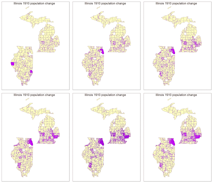
I ran into multiple obstacles in Lab 8. When learning to classify my population change data from the previous lab, there were missing spots coming up in my data. After multiple tries of trying to fix these missing spots, we decided to move along with the data including these missing spots. We found out these missing spots ended up being from counties that were not included in the ARCGIS counties files versus my own data that I looked up. It seems as though over the years, the counties were put together into one for many circumstances. I decided to pick five classes. The classification scheme that worked best for most of my data was natural breaks. Natural breaks separate according to logical break points and considers the distribution of the data. It also clearly shows the clusters and outliers in my data. This was also the final classification theme I went with due to it being easy to compare to other maps. I modified this scheme and changed the break values and made it my own so that it would work for all of my maps.
A color ramp provides the means to apply a range of colors to a group of symbols. I decided to go with an Algorithmic color ramp. These color ramps are a linear stretch between two specified colors designed to convey the amount or degree of a quantitative distribution. Mine goes from yellow to red. For both my graduated and proportional symbol maps, I decided to use a circle as my shape. I decided to use a circle because it is a compact symbol, and its smooth visual impression is good for my type of data. For my graduated symbol map I decided to use different hues of blue, and the proportional symbol map I used different hues of green. Using a single-ended hue worked well with the type of data I was showing. For dot density, I also chose one color that worked well to display my data the best.
Subscribe to:
Posts (Atom)


